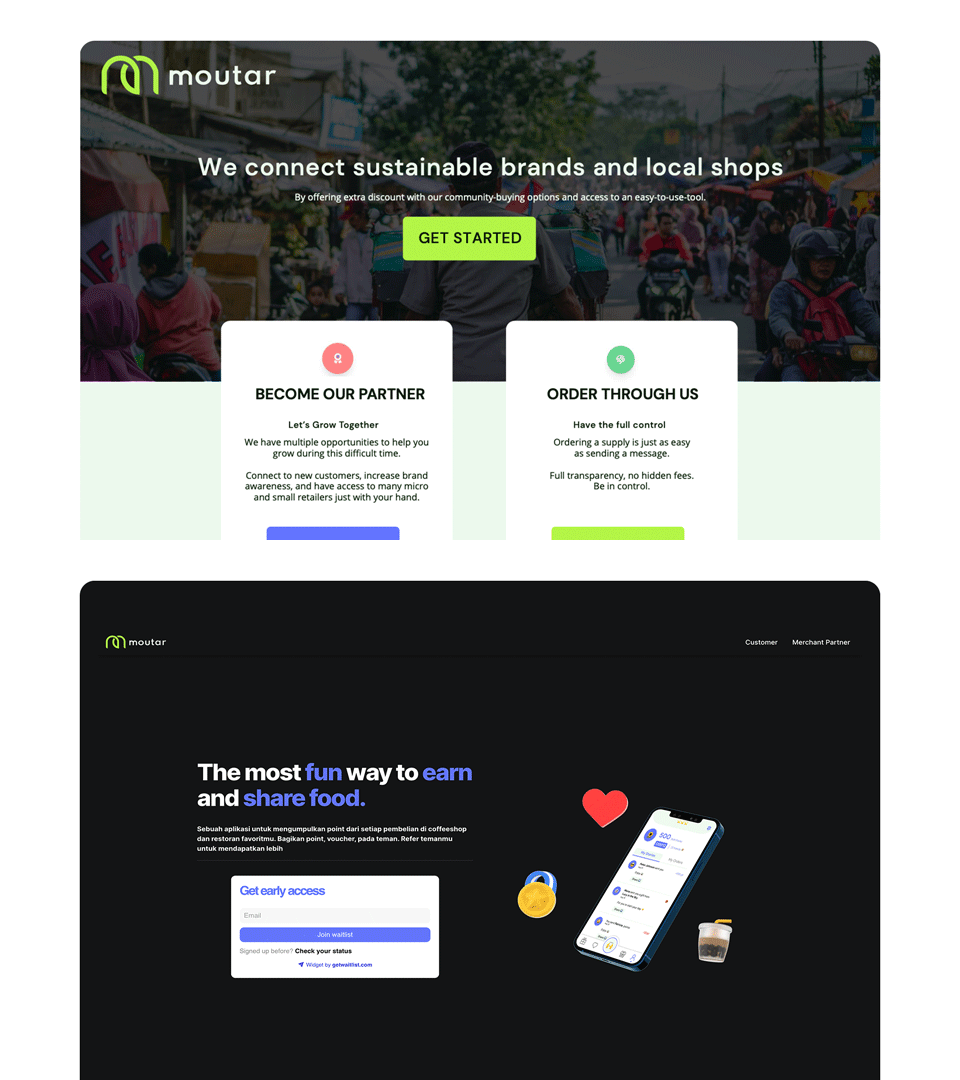
Speak to GenZ: Moutar
Role: Product Designer| Deliverables: Landing page
Fun · Easy · Green
Introduction
Moutar is a B2C company which is specialized to solve the problems for F&B shops in Indonesia. It helps consumers save and get rewards while empowering small and medium-sized F&B shops to grow in the digital economy. Moutar’s key offering includes cashless payments, online/offline deals, planet-friendly products, and other offers.
In this project, we revamped Moutar’s landing page as we switched from B2B to B2C.
My Role
I led the design, user testing, finding solutions, community building of this project from end to end.
Our Users
Before we started designing, we deep dive into the existing behavior of our users to understand them better.
We also conducted a series of users interviews.
We focused on identifying what is the job that our customers hire our product for.
We defined user archetypes and mapped them to their respective jobs-to-be-done.
Problems
Switched from B2B to B2C
Our business model is changed. Our goal is changed. Our target is changed. So does our landing page.
Goals
Define who we are and what we do.
The main goal is to re-introduce who we are to our potential business partners.
Multi -functional
Also, it’s to communicate to multi-parties at the same time.
Process
We established 3 design principles for the brand and make sure the landing page we design was based on these principles.
These principles are centered around our clients.
Less is more.
Multiple iterations
Since we switched our business modal. We have to dive into our new users.
In order to understand our users, we conducted a lot of surveys and interviews with them.
Built it without code
So that we can build and test things faster.
We fail fast, in order to learn faster.
Sketches
We started sketching some crazy ideas in our minds. Our focus at this stage is to diverge first, converge later.
Final Designs/ Solutions
Fun · Easy · Green
Re-Introduce a new image
Our previous main users are brands (Manufacture) and shops (F&B shops).
Since we re-position ourselves. We were still discovering our business model.
So we changed our brand along the way. We create new elements (fun emojis) for the customers-facing side.
Find the right tone of voice
Since we are communicating to multi-parties, the tone of voice has to be changed accordingly.
What we learned
We fail fast, in order to learn faster.
We build the landing page without code. So that we can test things faster and change accordingly. We do real user testing
which is more accurate.


